Android UI Essentials: Crafting Stunning & Interactive Interfaces
Comprehensive Guide to Views, Attributes, and Custom Drawables for Better Android Interfaces

Introduction to UI in Android
XML - eXtensible Markup Language is a markup language used to create layouts for application screen in Android Development.
Layout defines the structure of the User Interface in our application. Layout in Android is built using a combination of Views and ViewGroup. Layouts contain one and only one Root View Element, that is the parent of all the child Views and ViewGroups.
View - a single building block of screen ui : acts as an element, which can display something at the interface or handle an event. Objects of view class are called
WidgetsExample - Text, ImageView, Button, etc.
ViewGroup - acts as an invisible container, which gives a layout to the view and
viewgroups declared under it. Objects of the ViewGroup class are called
LayoutsExample - ListView, GridView, LinearLayout, etc.
Viewis a superclass of all the graphical user interface components.open class View : Drawable.Callback, KeyEvent.Callback, AccessibilityEventSource
where
android.view.ViewGroupis the subclass ofViewand is the base class for layouts.

<?xml version="1.0" encoding="utf-8"?>
<LinearLayout xmlns:android="http://schemas.android.com/apk/res/android"
              android:layout_width="match_parent"
              android:layout_height="match_parent"
              android:orientation="vertical" >
    <TextView android:id="@+id/text"
              android:layout_width="wrap_content"
              android:layout_height="wrap_content"
              android:text="Hello, I am a TextView" />
    <Button android:id="@+id/button"
            android:layout_width="wrap_content"
            android:layout_height="wrap_content"
            android:text="Hello, I am a Button" />
</LinearLayout>
The above layout file consists of LinearLayout as the root element and it holds the TextView and Button element.
XML files are located inside the res/layout/ directory.
During the compilation of the application each XML layout file is compiled into a
Viewresource. Load the layout resource in your app'sActivity.onCreate()callback implementation. Do so by callingsetContentView(), passing it the reference to your layout resource in the form:R.layout.layout_file_name.
fun onCreate(savedInstanceState: Bundle) {
    super.onCreate(savedInstanceState)
    setContentView(R.layout.main_layout)
}
Attributes
Every View and ViewGroup object has its own variety of XML attributes. Some attributes are specific to a View object. And some are common to all View objects because they are inherited from the root View class, like the id attribute.
Other attributes are layout parameters, which are attributes that describe layout orientations of the View object.
ID
Each View object has an integer ID associated with it, that uniquely identifies that View object. During the app compilation, an integer ID is assigned to the string ID given in the XML format.
<LinearLayout android:id="@+id/my_button" />
/* here @ indicates that it needs to be identified as an ID resource
        + indicates a new resource name that must be created and added
          to the resources in the R.java file.
An ID doesn't need to be unique throughout the entire tree, but it must be unique within the part of the tree you search. It might often be the entire tree, so it's best to make it unique when possible.
Views can be referenced in the application by creating an instance of that View object and capturing it from the layout file.
val addButton: Button = findViewById(R.id.addBtn)
// here addBtn is the ID given in the XML file
Layout Parameters
Define layout parameters for the View that are appropriate for the ViewGroup it resides in. Every ViewGroup class implements a nested class that extends ViewGroup.LayoutParams. This subclass contains property types that define the size and position of each child view based on that ViewGroup.
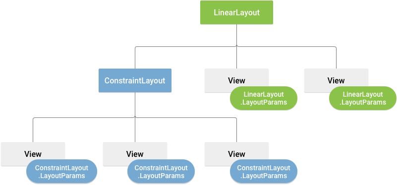
All view groups include a width and height, using layout_width and layout_height, and each view is required to define them.
You can specify width and height with exact pixel measurement, but more often we use :
wrap_content: tells your view to size itself to the dimensions required by its content.match_parent: tells your view to become as big as its parent view group allows.density-independent pixel units (
dp)
Padding & Margins
Padding is used to offset the content of the view. However, the margin specifies the extra space the view takes inside the parent.

Padding can be set using the setPadding(int, int, int, int) method and queried by calling getPaddingLeft(), getPaddingTop(), getPaddingRight(), and getPaddingBottom().
However, it is more convenient to set them using the XML format.
  <?xml version="1.0" encoding="utf-8"?>
  <LinearLayout xmlns:android="http://schemas.android.com/apk/res/android"
                android:layout_width="match_parent"
                android:layout_height="match_parent"
                android:orientation="vertical" >
      <TextView android:id="@+id/text"
                android:layout_width="wrap_content"
                android:layout_height="wrap_content"
                android:layout_margin="16dp"
                android:padding="8dp"
                android:text="Hello, I am a TextView" />
      <Button android:id="@+id/button"
              android:layout_width="wrap_content"
              android:layout_height="wrap_content"
              android:layout_marginTop="16dp"
              android:paddingBottom="4dp"
              android:paddingEnd="8dp"
              android:paddingStart="8dp"
              android:paddingTop="4dp"
              android:text="Hello, I am a Button" />
  </LinearLayout>
More XML attributes under View Class
android:alpha | float value: transparency value of view, for code: View.setAlpha(float) |
android:autoHandwritingEnabled | boolean value: stylus movement within view will trigger handwriting mode, for code: View.setAutoHandwritingEnabled(boolean) |
android:autofillHints | describes the content of view, for the autofill service to fill appropriate data. eg: password, username, for code: View.setAutofillHints(View.AUTOFILL_HINT_PASSWORD) |
android:background | drawable to use as background. for code: View.setBackgroundResource(int) |
android:backgroundTint | sets tint to apply to background, for code: View.setBackgroundTintList(ColorStateList) |
android:clickable | boolean value: defines whether this view reacts to click events, for code: View.setClickable(boolean) |
android:fadeScrollbars | boolean value: defines whether to fade out scrollbar, when they are not in use, for code: View.setScrollbarFadingEnabled(boolean) |
android:longClickable | boolean value, defines whether view reacts to long click events, for code: View.setLongClickable(boolean) |
android:onClick | defines method to invoke when view clicked, function should be declared in activity |
android:visibility | int value, controls visibility of the view, for code: View.setVisibility(int) → 0: visible, 1: invisible, 2:gone |
UI → Views
TextView
Android TextView is simply a view that is used to display the text to the user and optionally allows us to modify or edit it. The TextView class inherits from the View class & the ViewTreeObserver class
open class TextView : View, ViewTreeObserver.OnPreDrawListener

TextView inherits all the attributes of View Class & some common XML attributes for TextView are :
android:allowUndocontrols, whether undo, is allowed to textview or not.android:autoLinkconverts links to clickable linksandroid:autoTextautocorrects the textual inputandroid:capitalizecapitalizes the textual inputandroid:digitsspecifies numeric input to textandroid:drawableBottom,android:drawableEnd,android:drawableLeft,android:drawableRight,android:drawableStartspecifies drawable with the textviewandroid:drawablePaddingadds padding to the drawableandroid:ellipsizecauses words that are longer than the view is wide to be ellipsized instead of broken in the middleandroid:emsmakes the TextView be exactly this many ems wide.android:fontFamilyspecifies the font family for the textandroid:gravityspecifies how to align the text within the viewandroid:hintspecifies the hint msg to display when no textandroid:inputTypespecifies the input type of the textviewandroid:passwordmakes the characters displayed as a dotandroid:textspecifies the text to displayandroid:textColorandroid:textColorHighlightandroid:textColorHintandroid:textColorLinkspecify the text colorandroid:textSizeandroid:textStylespecify the text appearanceandroid:scrollHorizontallyallow text to be scrolled horizontally
Demonstration of TextView :
<TextView
    android:id="@+id/introText"
    android:layout_width="wrap_content"
    android:layout_height="wrap_content"
    android:layout_marginTop="100dp"
    android:text="this is an introduction to text views"
    android:paddingLeft="10dp"
    android:fontFamily="@font/sanfro"
    android:textStyle="bold"
    android:textSize="30sp"/>
Gives a margin of 100dp with the top of the layout —— adds a padding of 10dp at the left within the textview —— assigns font family to the textView which is located inside the res/fonts directory named sanfro —— makes the text bold and of 30sp.
<TextView
    android:id="@+id/descText"
    android:layout_width="150dp"
    android:layout_height="150dp"
    android:layout_gravity="center"
    android:layout_marginTop="50dp"
    android:text="multi line text view in android, has some special attributes"
    android:textSize="20sp"
    android:textStyle="italic"
    android:textColor="#ff90"
    android:ellipsize="end"
    android:ems="3"/>
Makes the view come to the centre of the layout —— give a margin of 50dp with the textbox above it —— assign the text size, colour and style
<TextView
    android:id="@+id/textImage"
    android:layout_width="wrap_content"
    android:layout_height="wrap_content"
    android:layout_marginTop="50dp"
    android:paddingLeft="20dp"
    android:text="text with drawable/image"
    android:textStyle="bold"
    android:textSize="24sp"
    android:drawableRight="@drawable/ic_launcher_background"
    android:drawablePadding="10dp"/>
adds a 50dp margin with the textbox above it —— adds a padding of 20dp to the left within the textbox —— gives text style and size —— adds a drawable file at the right located in the res/drawable directory —— add padding to the drawable within the textview

Demonstration of TextView in the functional Kotlin code :
//import..
class MainActivity : AppCompatActivity() {
    override fun onCreate(savedInstanceState: Bundle?) {
        super.onCreate(savedInstanceState)
        setContentView(R.layout.activity_main)
        val textView = findViewById<TextView>(R.id.descText)
//we refer textView variable to the TextView resource with id descText
        val text  = textView.text.toString()
//we get is text and convert it into string using the toString() method
        Log.d("msg: ", text)
//we return that text in the logcat

        val heading = findViewById<TextView>(R.id.introText)
//we refer heading variable to the TextView resource with id introText
        heading.text = "Hi ${10/5}"
//we set the resource text
    }
}
Button
Android Button is a widget that is used to notice interactions and trigger actions in the application. The Button Class extends the TextView class in Kotlin.
open class Button : TextView

Button inherits all the XML attributes of TextView and View class & some common XML attributes are :
android:onClickspecifies the Kotlin function that is invoked in the activity when the button is clickedandroid:backgroundsets the background color/drawable on the Button.
Demonstration of Button :
<androidx.constraintlayout.widget.ConstraintLayout xmlns:android="http://schemas.android.com/apk/res/android"
    xmlns:app="http://schemas.android.com/apk/res-auto"
    xmlns:tools="http://schemas.android.com/tools"
    android:layout_width="match_parent"
    android:layout_height="match_parent"
    tools:context=".MainActivity">
    <TextView ... />

    <Button
        android:id="@+id/boldBtn"
        android:layout_width="wrap_content"
        android:layout_height="wrap_content"
        android:text="BOLD"
        android:textColor="@color/white"
        android:layout_marginTop="45dp"
        app:layout_constraintEnd_toEndOf="parent"
        app:layout_constraintStart_toStartOf="parent"
        app:layout_constraintTop_toBottomOf="@+id/textView" />

    <TextView ... />
</androidx.constraintlayout.widget.ConstraintLayout>
Here our Root View is the constraint layout, that enables us to define layouts based on constraints to other layouts.

Demonstration of Button in the functional Kotlin code :
setOnClickListener- triggers when a button is clicked.setOnLongClickListner- triggers when a button is pressed for a longer duration. requires an ending false boolean value to trigger. if true, doesn't trigger.
The curly brackets following the two click listeners are lambda expressions.
//import..
class MainActivity : AppCompatActivity() {
    override fun onCreate(savedInstanceState: Bundle?) {
        super.onCreate(savedInstanceState)
        setContentView(R.layout.activity_main)
        val boldButton = findViewById<Button>(R.id.boldBtn)
        val textbox = findViewById<TextView>(R.id.textView)

        boldButton.setOnClickListener{ //sets the text to bold
            textbox.setTypeface(null, Typeface.BOLD)
        }
        boldButton.setOnLongClickListener{ //changes the text
            textbox.text = "Bye!"
            false //trigger the LongClickListener
        }
    }
}
EditText
Android EditText is a user interface control that allows the user to enter or modify the text. The EditText class inherits from the TextView Class.
open class EditText : TextView

EditText inherits all the XML attributes of TextView and View class & some common attributes of EditText are :
android:inputTypespecifies the input type required. date, text, number. etc.
Demonstration of EditText :
<androidx.constraintlayout.widget.ConstraintLayout xmlns:android="http://schemas.android.com/apk/res/android"
    xmlns:app="http://schemas.android.com/apk/res-auto"
    xmlns:tools="http://schemas.android.com/tools"
    android:layout_width="match_parent"
    android:layout_height="match_parent"
    tools:context=".MainActivity">

    <EditText
        android:id="@+id/usernameET"
        android:layout_width="200dp"
        android:layout_height="wrap_content"
        android:hint="Username"
        android:inputType="text"
        android:layout_marginTop="100dp"
        app:layout_constraintEnd_toEndOf="parent"
        app:layout_constraintStart_toStartOf="parent"
        app:layout_constraintTop_toTopOf="parent" />

    <Button ... />

</androidx.constraintlayout.widget.ConstraintLayout>
Here our Root Element in Constraint Layout, which has an EditText and a Button. The EditText has a text input type and a hint for the user to input a username.

Demonstration of EditText in the functional Kotlin code :
//import..
class MainActivity : AppCompatActivity() {
    override fun onCreate(savedInstanceState: Bundle?) {
        super.onCreate(savedInstanceState)
        setContentView(R.layout.activity_main)

        val inputUsername = findViewById<EditText>(R.id.usernameET)
        val btn = findViewById<Button>(R.id.btn)

        btn.setOnClickListener{
            val username = inputUsername.text.toString()
//storing the input in the username variable
            Log.d("Username: ", username)
//displaying the username value in the logcat
        }
    }
}
ImageView
Android ImageView is a user interface control that is used to display any type of image resource in the application. ImageView class is a direct subclass of the Kotlin View Class
open class ImageView : View

Some common XML attributes for ImageView are :
android:adjustViewBoundsadjust the bounds of the drawable to maintain its aspect ratioandroid:cropToPaddingcrops the image to fit within the paddingandroid:maxHeightgives a maximum height to the Viewandroid:maxWidthgives a maximum width to the Viewandroid:scaleTypespecifies how the image should be resized or moved to match the view's size. Values include center, centerCrop, fitCenter, etc.android:srcspecifies the drawable to set in the viewandroid:tintsets the tinting color of the image
Demonstration of ImageView :
<androidx.constraintlayout.widget.ConstraintLayout xmlns:android="http://schemas.android.com/apk/res/android"
    xmlns:app="http://schemas.android.com/apk/res-auto"
    xmlns:tools="http://schemas.android.com/tools"
    android:layout_width="match_parent"
    android:layout_height="match_parent"
    tools:context=".MainActivity">

    <ImageView
        android:id="@+id/imageView"
        android:layout_width="wrap_content"
        android:layout_height="wrap_content"
        android:background="@color/black"
        android:src="@drawable/ic_launcher_foreground"
        app:layout_constraintBottom_toBottomOf="parent"
        app:layout_constraintEnd_toEndOf="parent"
        app:layout_constraintStart_toStartOf="parent"
        app:layout_constraintTop_toTopOf="parent"
        app:tint="@color/white" />

    <Button ... />

</androidx.constraintlayout.widget.ConstraintLayout>
Here the Root Element is a Constraint Layout which has an ImageView and a Button. The ImageView has a default image named ic_launcher_foreground in the res/drawable directory.

Demonstration of ImageView in the functional Kotlin code :
//import..
class MainActivity : AppCompatActivity() {
    override fun onCreate(savedInstanceState: Bundle?) {
        super.onCreate(savedInstanceState)
        setContentView(R.layout.activity_main)
        val image = findViewById<ImageView>(R.id.imageView)
        val btn = findViewById<Button>(R.id.changeBtn)

        btn.setOnClickListener{
            image.setImageResource(R.drawable.person)
//image resource should be stored in drawable folder
//change image resource of imageview to R.drawable.person on button click
        }
    }
}
ImageButton
Android ImageButton is a widget that is used to display a button having an image. The ImageButton class inherits from the ImageView class
open class ImageButton : ImageView

ImageButton works exactly like a android.widget.Button, and the image on the button is added using android:src attribute or the setImageResource(int) method.
ImageButton inherits all the XML attributes of ImageView and View class
CardView
CardView is a versatile widget provided by Android that is used to create a container with multiple views.
Some common XML attributes for CardView are :
app:cardCornerRadius Sets the corner radius of the card.app:cardElevation Sets the shadow elevation of the card.app:cardBackgroundColor Changes the card’s background color.app:cardUseCompatPadding Ensures consistent padding for the card across devices.app:cardPreventCornerOverlap Prevents overlapping content from going outside the rounded corners.
Demonstration of CardView :
<?xml version="1.0" encoding="utf-8"?>
<androidx.constraintlayout.widget.ConstraintLayout xmlns:android="http://schemas.android.com/apk/res/android"
    //statements>
    <androidx.cardview.widget.CardView
        android:layout_width="200dp"
        android:layout_height="300dp"
        app:cardCornerRadius="20dp"
        app:cardElevation="20dp"
        android:text="Hello World!"
        app:layout_constraintBottom_toBottomOf="parent"
        app:layout_constraintEnd_toEndOf="parent"
        app:layout_constraintStart_toStartOf="parent"
        app:layout_constraintTop_toTopOf="parent">
        <androidx.constraintlayout.widget.ConstraintLayout
            android:layout_width="match_parent"
            android:layout_height="match_parent">

            <ImageView ../>
            <TextView ../>
        </androidx.constraintlayout.widget.ConstraintLayout>
    </androidx.cardview.widget.CardView>

</androidx.constraintlayout.widget.ConstraintLayout>

Demonstration of CardView in functional Kotlin code :
val cardView = findViewById<CardView>(R.id.cardView)
cardView.setOnClickListener {
    Toast.makeText(this, "Card clicked!", Toast.LENGTH_SHORT).show()
}
CheckBox
Android CheckBox is a common widget that works as a Button and has two states, checked & unchecked. The CheckBox class inherits from the CompoundButton class which is further inherited from the Button class
open class CheckBox : CompoundButton

CheckBox inherits all the XML attributes of TextView,View, Button & Compound Button class & some common attributes of CompoundButton are :
android:checkedwhich specifies the initial checked state of the button
Demonstration of Checkbox :
<androidx.constraintlayout.widget.ConstraintLayout xmlns:android="http://schemas.android.com/apk/res/android"
    xmlns:app="http://schemas.android.com/apk/res-auto"
    xmlns:tools="http://schemas.android.com/tools"
    android:layout_width="match_parent"
    android:layout_height="match_parent"
    tools:context=".MainActivity">

    <TextView ... />
    <CheckBox
        android:id="@+id/pannerCheck"
        android:layout_width="wrap_content"
        android:layout_height="wrap_content"
        android:text="Panner"
        android:layout_marginTop="20dp"
        android:layout_marginLeft="-270dp"
        app:layout_constraintEnd_toEndOf="parent"
        app:layout_constraintStart_toStartOf="parent"
        app:layout_constraintTop_toBottomOf="@+id/textView" />
    <CheckBox
        android:id="@+id/cheeseCheck" .. />
    <CheckBox
        android:id="@+id/mushCheck" ..  />

</androidx.constraintlayout.widget.ConstraintLayout>
Here we define 3 Checkbox under our Root View Element.

Demonstration of CheckBox in the functional Kotlin code :
//import..
class MainActivity : AppCompatActivity() {
    override fun onCreate(savedInstanceState: Bundle?) {
        super.onCreate(savedInstanceState)
        setContentView(R.layout.activity_main)

        val panner = findViewById<CheckBox>(R.id.pannerCheck)
        val cheese = findViewById<CheckBox>(R.id.cheeseCheck)
        val mushroom = findViewById<CheckBox>(R.id.mushCheck)

        panner.setOnCheckedChangeListener{ _, isChecked ->
            val text = "You want the following toppings: " + (if (isChecked) "Panner" else "") + (if (cheese.isChecked) "Cheese" else "") + (if (mushroom.isChecked) "Mushroom" else "")
            Log.d("Order: ", text)
        }
//following method is called when the state of the checkbox is changed
//where _ represents the compound button whose state is changed
//isChecked returns the state as a boolean value
//followed by a lambda expression
        cheese.setOnCheckedChangeListener{ _, isChecked ->
            val text = "You want the following toppings: " + (if (panner.isChecked) "Panner" else "") + (if (isChecked) "Cheese" else "") + (if (mushroom.isChecked) "Mushroom" else "")
            Log.d("Order: ", text)
        }
        mushroom.setOnCheckedChangeListener{ _, isChecked ->
            val text = "You want the following toppings: " + (if (panner.isChecked) "Panner" else "") + (if (cheese.isChecked) "Cheese" else "") + (if (isChecked) "Mushroom" else "")
            Log.d("Order: ", text)
        }
    }
}

ToggleButton
Android, ToggleButton is just like a switch containing two states either ON or OFF, unlike switch, it doesn't have a slider. The ToggleButton class inherits from the CompoundButton class which is further inherited from the Button class
open class ToggleButton : CompoundButton

ToggleButton inherits all the XML attributes of TextView,View, Button & Compound Button class & some common attributes of ToggleButton are :
android:textOffspecifies text when the button is offandroid:textOnspecifies text when the button is onandroid:disabledAlphaspecifies the alpha to apply to the indicator when disabled.
Demonstration of ToggleButton :
<androidx.constraintlayout.widget.ConstraintLayout xmlns:android="http://schemas.android.com/apk/res/android"
    xmlns:app="http://schemas.android.com/apk/res-auto"
    xmlns:tools="http://schemas.android.com/tools"
    android:layout_width="match_parent"
    android:layout_height="match_parent"
    tools:context=".MainActivity">

    <ToggleButton
        android:id="@+id/btn"
        android:layout_width="wrap_content"
        android:layout_height="wrap_content"
        android:textOff="Off"
        android:textOn="On"
        android:textSize="32sp"
        android:disabledAlpha="0.5"
        app:layout_constraintBottom_toBottomOf="parent"
        app:layout_constraintEnd_toEndOf="parent"
        app:layout_constraintStart_toStartOf="parent"
        app:layout_constraintTop_toTopOf="parent" />

</androidx.constraintlayout.widget.ConstraintLayout>

Demonstration of ToggleButton in the functional Kotlin code :
import android.os.Bundle
import android.util.Log
import android.widget.ToggleButton

class MainActivity : AppCompatActivity() {
    override fun onCreate(savedInstanceState: Bundle?) {
        super.onCreate(savedInstanceState)
        setContentView(R.layout.activity_main)

        val btn = findViewById<ToggleButton>(R.id.btn)
        btn.setChecked(true)
        btn.setOnCheckedChangeListener{ _, isChecked ->
            Log.d("Status:","You turned it" + (if (isChecked) "On" else "Off"))
        }
    }
}
Switch
Similar to the Toggle Button, but this one is from the Material Components Library.
open class SwitchMaterial : CompoundButton
Some common XML attributes for Switch are :
android:checked Defines the initial state (on/off).app:thumbColor Sets the color of the thumb (toggle).app:trackColor Sets the color of the track.app:useMaterialThemeColors If set to true, applies the Material theme colors automatically.
Demonstration of Switch :
<androidx.constraintlayout.widget.ConstraintLayout xmlns:android="http://schemas.android.com/apk/res/android"
    xmlns:app="http://schemas.android.com/apk/res-auto"
    android:layout_width="match_parent"
    android:layout_height="match_parent"
    android:padding="16dp">
    <com.google.android.material.switchmaterial.SwitchMaterial
        android:id="@+id/material_switch"
        android:layout_width="wrap_content"
        android:layout_height="wrap_content"
        android:text="@string/material_switch"
        app:layout_constraintEnd_toEndOf="parent"
        app:layout_constraintStart_toStartOf="parent"
        app:layout_constraintTop_toTopOf="parent" />
</androidx.constraintlayout.widget.ConstraintLayout>

Demonstration of Switch in functional Kotlin code :
class MainActivity : AppCompatActivity() {
    override fun onCreate(savedInstanceState: Bundle?) {
        super.onCreate(savedInstanceState)
        val binding: SwitchLayoutBinding = SwitchLayoutBinding.inflate(layoutInflater)
        setContentView(binding.root)
        binding.materialSwitch.setOnCheckedChangeListener { _, isChecked ->
            if (isChecked)// The switch is checked.
            else // The switch isn't checked.
        }
    }
}
Seek-bar
Widget that allows users to select a value from a continuous or discrete range by dragging a thumb (slider).
Some common XML attributes for Seek-bar are :
android:max Sets the maximum value of the SeekBar.android:progress Sets the current progress (default position of the thumb).android:thumb Defines a custom drawable for the slider's thumb.android:secondaryProgress Sets a secondary progress bar (useful for buffered progress in streaming apps).
Demonstration of Seek-bar :
<?xml version="1.0" encoding="utf-8"?>
<androidx.constraintlayout.widget.ConstraintLayout ..>
    <SeekBar
        android:id="@+id/seekbar"
        android:max="100"
        android:layout_width="match_parent"
        android:layout_height="wrap_content"
        android:layout_marginHorizontal="20dp"
        app:layout_constraintBottom_toTopOf="@+id/textView"
        app:layout_constraintEnd_toEndOf="parent"
        app:layout_constraintStart_toStartOf="parent"
        app:layout_constraintTop_toTopOf="parent" />
    <TextView .. />
</androidx.constraintlayout.widget.ConstraintLayout>

Demonstration of Seek-bar in functional Kotlin code:
class MainActivity : AppCompatActivity() {
    override fun onCreate(savedInstanceState: Bundle?) {
        //statements..
        val seekBar = findViewById<SeekBar>(R.id.seekbar)
        val textView = findViewById<TextView>(R.id.textView)
        seekBar.setOnSeekBarChangeListener(object : SeekBar.OnSeekBarChangeListener{
            override fun onProgressChanged(p0: SeekBar?, p1: Int, p2: Boolean) {
                textView.text = "Progress: " + p1.toString()
            }
            override fun onStartTrackingTouch(p0: SeekBar?) {
                //statments
            }
            override fun onStopTrackingTouch(p0: SeekBar?) {
                textView.text = "selected ${p0?.progress}"
            }
        })
    }
}
Adding Custom Drawable to Seek-bar :
seekbar_thumb.xml
<?xml version="1.0" encoding="utf-8"?>
<shape xmlns:android="http://schemas.android.com/apk/res/android"
    android:shape="oval">
  <stroke android:color="#CDDC39"
      android:width="4dp"/>
    <solid android:color="@color/black"/>
    <size android:height="24dp" android:width="24dp"/>
</shape>
seekbar_line.xml
<?xml version="1.0" encoding="utf-8"?>
<layer-list xmlns:android="http://schemas.android.com/apk/res/android">
    <item android:gravity="center_vertical">
        <shape android:shape="rectangle">
            <solid android:color="#605A5C"/>
            <size android:height="5dp"/>
        </shape>
    </item>
</layer-list>
Adding to Seekbar View in XML :

<Seekbar
    ...
    android:thumb="@drawable/seekbar_thumb"
    android:progressDrawable="@drawable/custom_seekbar">
</Seekbar>
Spinner
Android Spinner is used to create a drop-down list on the screen. The spinner is loaded with data using an Adapter. The adapter sets the data as well as the layout for the items to be loaded in the Spinner. The spinner class inherits from the AbsSpinner and DialogInterface.OnClickListener class
open class Spinner : AbsSpinner, DialogInterface.OnClickListener

Some common XML attributes for Spinner are :
android:entrieswhich specifies the entries of the spinners dialog, if the entries are stored in thestrings.xmlfile from theres/valuesdirectoryandroid:popupBackgroundwhich specifies the background drawable for the dropdown popupandroid:promptwhich specifies the prompt to display when the spinner dialog is shownandroid:spinnerModewhich specifies the display mode for spinner options(dialog, or dropdown)
Demonstration of Spinner :
Ways of linking data to the Spinners dialog :
<resources>
    <string name="app_name">spinner</string>
    <string-array name="gender">
        <item>Male</item>
        <item>Female</item>
    </string-array>
</resources>
adding data items to the strings.xml file in the res/values directory, in the form of a string array.
This string array can be linked to the spinner using the XML attribute :
<Spinner .. android:entries="@array/gender" .. />
Or in the Kotlin code file using the Adapter :
class MainActivity : AppCompatActivity() {
    override fun onCreate(savedInstanceState: Bundle?) { //statements..
        val spinner = findViewById<Spinner>(R.id.spinner)
        val valuesGender = resources.getStringArray(R.array.gender)
//specify variable to our string array resource using
//resources.getStringArray(int) method

        val adapter = ArrayAdapter( this, android.R.layout.simple_spinner_item, valuesGender)
        spinner.adapter = adapter
        }
    }
}
The data can also be linked directly from the Kotlin Code file by creating an array or list object and specifying the adapter and spinner all in the same block :
class MainActivity : AppCompatActivity() {
    override fun onCreate(savedInstanceState: Bundle?) { //statements..
        val spinner = findViewById<Spinner>(R.id.spinner)
        val genderList = listOf("Male","Female")
        val adapter = ArrayAdapter<String>(this,
        com.google.android.material.R.layout.support_simple_spinner_dropdown_item, genderList)
        spinner.adapter = adapter
    }
}

Demonstration of Spinner in the functional Kotlin code :
When the user selects an item from the spinner's menu, the Spinner object receives an on-item-selected event. To define the selection event handler for a spinner, we need to implement the AdapterView.OnItemSelectedListener interface and the corresponding onItemSelected() callback method.
spinner.onItemSelectedListener = object :AdapterView.OnItemSelectedListener{
    override fun onItemSelected(adapter: AdapterView<*>?, view: View?, position: Int, id: Long) {
// An item is selected. You can retrieve the selected item using
// adapter.getItemAtPosition(position).
// position specifies the index of the data selected
         Toast.makeText(this@MainActivity,
         "You selected ${adapter?.getItemAtPosition(position).toString()}",
         Toast.LENGTH_SHORT).show()
//here we need to specify this@MainActivity - as we are inside an anonymous class
    }
    override fun onNothingSelected(adapter: AdapterView<*>?) { }
}
RadioButton & RadioGroup
Android Radio buttons let the user select one option from a set of mutually exclusive options. Because radio buttons are mutually exclusive, group them inside a RadioGroup widget i.e. android.widget.RadioGroup. RadioGroup ensures that only one radio button within a group can be selected at a time.
The RadioButton class inherits from the CompoundButton class which is further inherited from the Button class
open class RadioButton : CompoundButton

When several radio buttons live inside a radio group, checking one radio button unchecks all the others.
RadioButton inherits all the XML attributes of TextView,View, Button & Compound Button class
The RadioGroup inherits from the LinearLayout class
open class RadioGroup : LinearLayout

RadioGroup inherits all the XML attributes of ViewGroup, View & LinearLayout class & some common attributes of RadioGroup are :
android:orientationspecifies the orientation of the child radio buttonsandroid:checkedButtonspecifies the default checked radio button
Demonstration of RadioButton & RadioGroup :
<androidx.constraintlayout.widget.ConstraintLayout ..>
    <RadioGroup
        android:id="@+id/btnHead"
        android:layout_width="wrap_content"
        android:layout_height="wrap_content"
        android:background="#dbeceb" ..
        <TextView .. />
        <RadioButton
            android:id="@+id/wish1btn"
            android:layout_width="wrap_content"
            android:layout_height="wrap_content"
            android:layout_marginTop="10dp"
            android:layout_marginLeft="10dp"
            android:paddingLeft="5sp"
            android:text="Wish 1"
            android:textSize="22sp"
            android:textStyle="bold" />
        <RadioButton .. />
        <RadioButton .. />
        <Button .. />
    </RadioGroup>
</androidx.constraintlayout.widget.ConstraintLayout>

Demonstration of RadioButton & RadioGroup in the functional Kotlin code :
class MainActivity : AppCompatActivity() {
    override fun onCreate(savedInstanceState: Bundle?) { //statements..
        val submit = findViewById<Button>(R.id.submitBtn)
        val radioGroupWish = findViewById<RadioGroup>(R.id.btnHead)

//getting radio group selected status and text using button click event
        submit.setOnClickListener{
            val checkedButtonID = radioGroupWish.checkedRadioButtonId
//radioGroup.checkedRadioButtonID returns the ID of the radiobutton checked
            val checkedButton = findViewById<RadioButton>(checkedButtonID)
            Log.d("Order: ",checkedButton.text.toString())
        }
    }
}

class MainActivity : AppCompatActivity() {
    override fun onCreate(savedInstanceState: Bundle?) { //statements..
        val radioGroupWish = findViewById<RadioGroup>(R.id.btnHead)

//getting radio group selected item using on checked change listener
        radioGroupWish.setOnCheckedChangeListener(
            RadioGroup.OnCheckedChangeListener { _, checkedId ->
                val checkedBtn =  findViewById<RadioButton>(checkedId)
                Log.d("Order: ",checkedBtn.text.toString())
            })
    }
}

Custom Drawables for Views
Drawables in Android are graphics resources used to define backgrounds, shapes, state-based icons, or other visual elements for UI components. They are stored in the res/drawable directory and can be created using XML or images.
Types of Drawables for Custom Views
Shape Drawable (
shape)Used to create custom buttons, backgrounds, and borders.
Can define solid colors, gradients, strokes, corners, and padding.
    <shape xmlns:android="http://schemas.android.com/apk/res/android"
        android:shape="rectangle">
        <corners android:radius="12dp"/>
        <solid android:color="@color/blue"/>
        <stroke android:width="2dp" android:color="@color/dark_blue"/>
        <padding android:left="10dp" android:right="10dp"/>
    </shape>
State List Drawable (
selector)Allows different appearances based on user interaction (e.g., pressed, focused, disabled).
Used for buttons, text fields, or list items.
    <selector xmlns:android="http://schemas.android.com/apk/res/android">
        <item android:state_pressed="true" android:drawable="@color/dark_blue"/>
        <item android:drawable="@color/blue"/>
    </selector>
Gradient Drawable
Creates linear, radial, or sweep gradients as backgrounds.
Commonly used for app backgrounds and buttons.
    <shape xmlns:android="http://schemas.android.com/apk/res/android">
        <gradient android:startColor="#FF5733" android:endColor="#C70039"
            android:angle="270"/>
    </shape>
Layer-List Drawable
Inset Drawable
Clip Drawable
Vector Drawables


